The challenge
They came to Code Enigma with half a website which was slow and bloated and a very complicated design which their previous agency was tripping over trying to implement.
The approach
We pitched a rescue mission to them, rescue what has been built and build whatever was left. There was a lot to do and not much budget left to do it in. Then to add all the extra things on WRAPs wishlist that we could, this is a typical Agile process.
After the onboarding meetings and creative positioning workshops, it was clear that the design wasn’t fitting the WRAP brand well enough and there were some large areas, which are key to the business, that weren’t started yet. There was a lot more to design and do than we first expected.
My personal objectives were to speed up the page load and add the vibrant personality which is WRAP and their attitude to circular economy.
WRAP put a lot of trust into me and gave me free reign to tidy up the website as I went. We had daily scrums with them so I could share what I was doing regularly. If I was going in the wrong direction then it wasn’t a weeks work down the drain making flat designs.
This resulted in very quick design ideas being shared between us to solve layout issues that we didn’t have time to address in traditional ways.
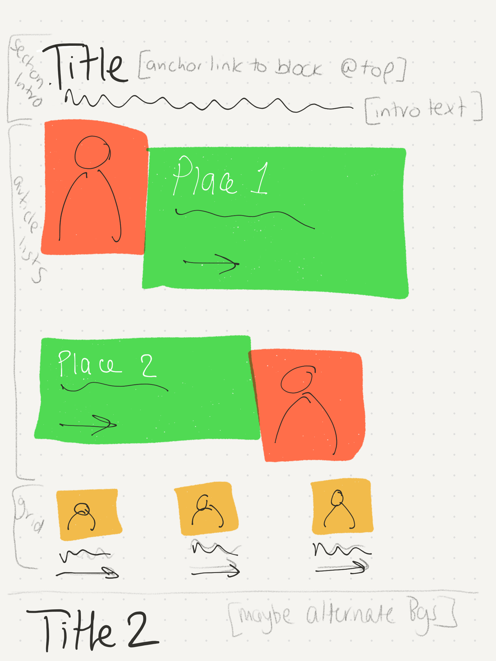
A sketch for complex sections
The result
When inheriting the website the homepage would make 289 requests to the server. Take 13.9 seconds to load and was 9.11MB in size. Today this is 46 requests, taking 4.09 seconds and 4.19MB
This is a 62.8% reduction of requests on the website which is now over 3 times faster.
Seeing as there was a lot to finish, clear up and reinvent entirely, for ‘keeping performance in mind’ it’s a good result.
The nitty-gritty.
Reducing the number of font weights
The original design looked very washed out and WRAP is a bright and bold organisation, so my first task was to change the font weights up a bit and increase the font size. This made the page more accessible and allowed me to reduce the number of different font weights from being loaded. used and marry the impactful content to the design better.
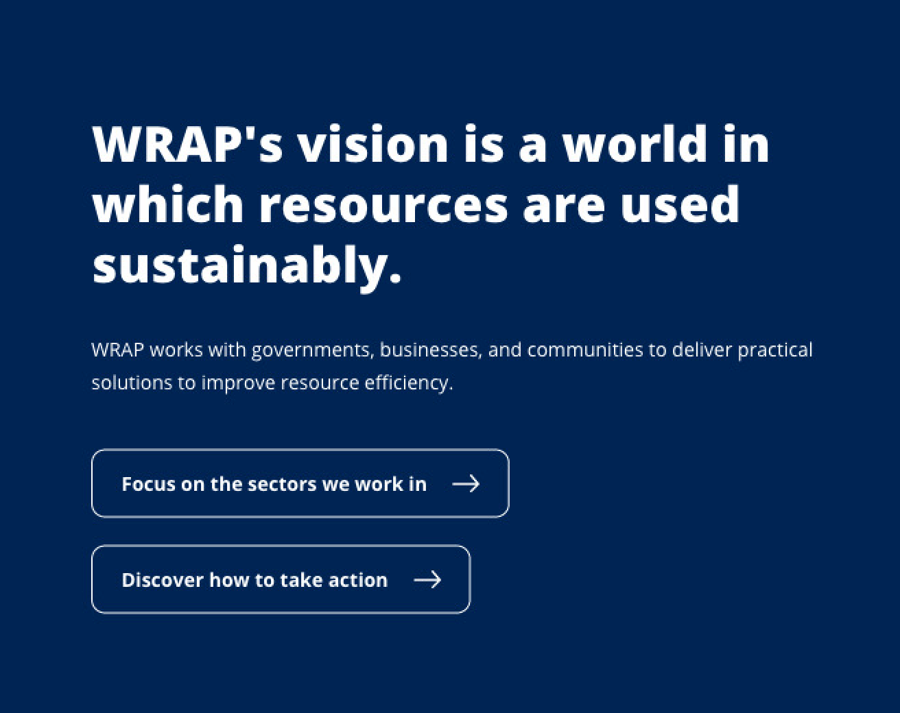
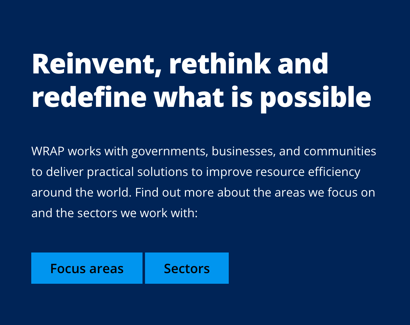
Before and After: Increasing the font sizes for better readability
Removing non-essential javascript
There were a lot of fun javascript interactions on the website, swiping things for mobile, parallax type things, scrolling things, all the things. I removed all them apart from one or two.
Simplifying the design
The intention for the curves on the website were to mimic the infinity loop from the logo, which is a neat idea. The problem was keeping the curves the right amount of curviness for it to look like the loop, when you take into account the responsiveness of the websites, this became very tricky. Instead of spending a lot of time and money to fix this we decided to remove them, they were also using up a lot of space and interrupting the flow of the website.
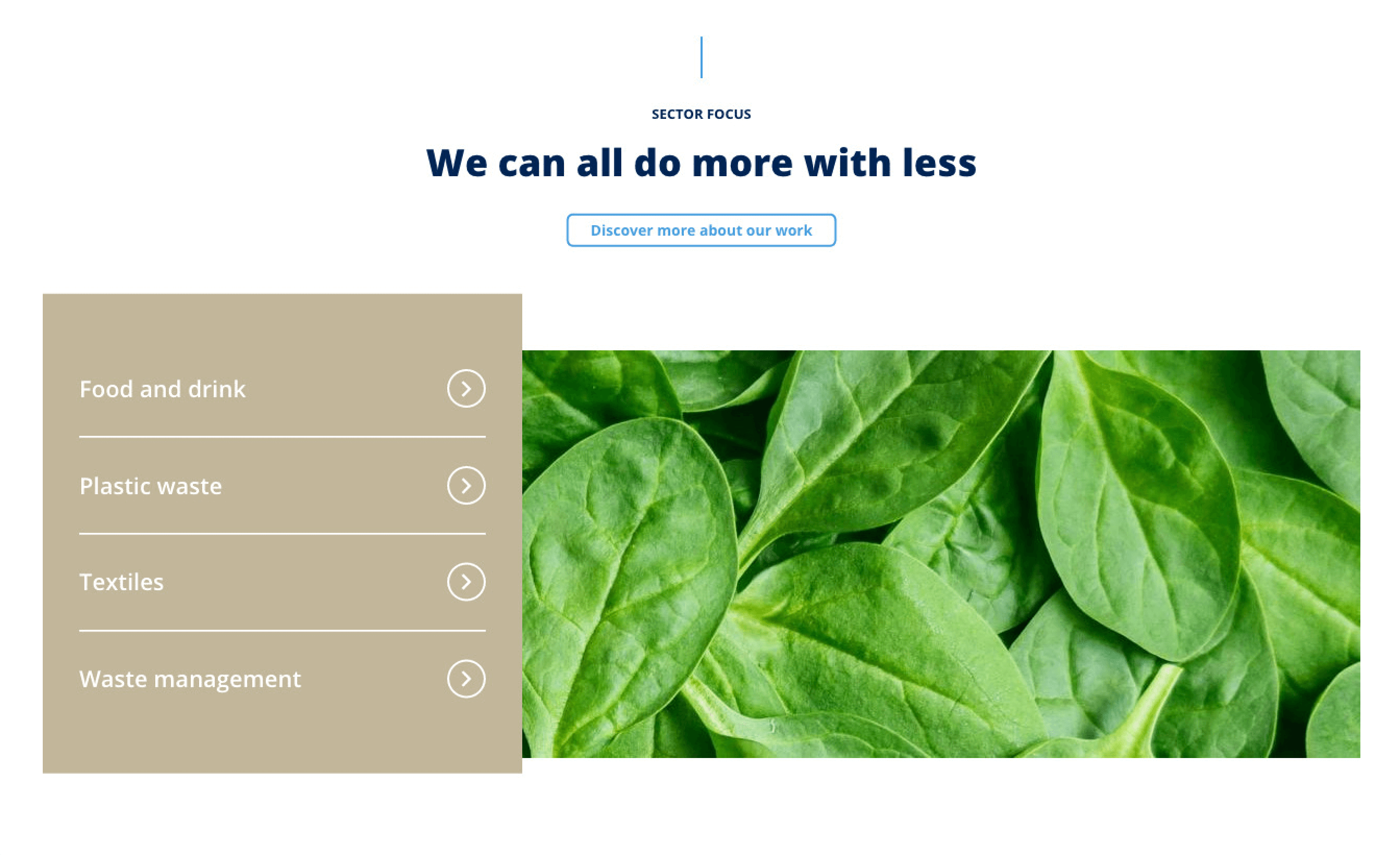
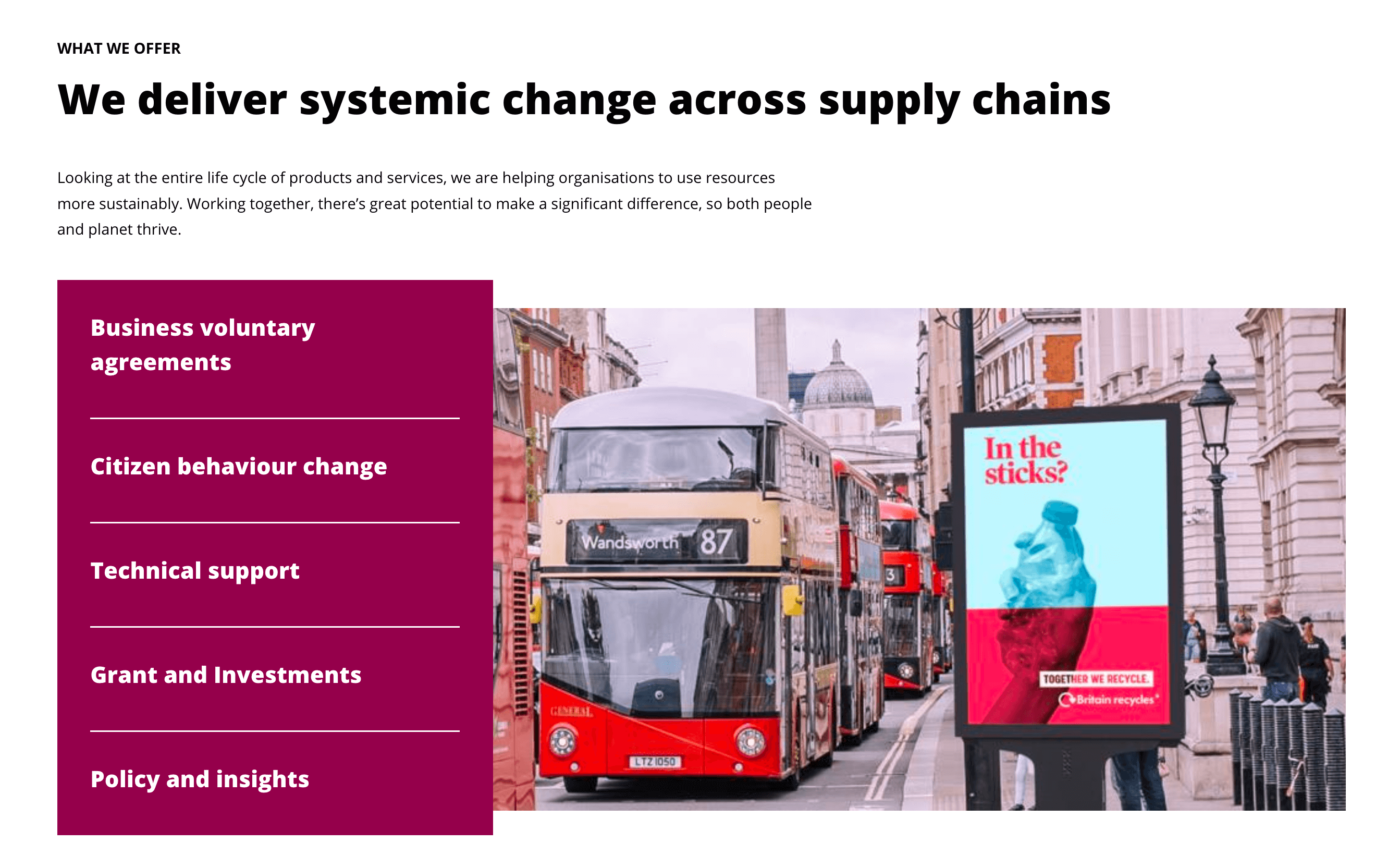
Before and After: Adding colour for better accessibility and to add energy to the brand.
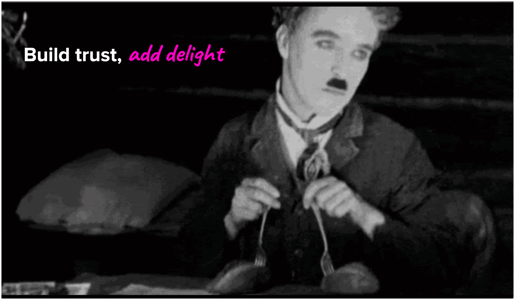
Adding delight
Basic CSS transitions were used to make small yellow features come to life on hover, focus or scroll. They are to imply that WRAP isn’t all doom and gloom about climate change and can provide help to businesses and citizens that seek help with the many areas of circular economy.
Working with WRAP is always a delight and I’d love to have the chance to do so again, I wish them all the best with their new website.